How We Created a Wayfinding Strategy for Akron Children’s Hospital
- Jul 1, 2025
- 5 min read
Inspired by other national children’s hospitals, Akron Children’s Hospital wanted to provide a better all-around patient experience that they could implement to not only their hospital, but their offsite locations.


Walking in Their Shoes
We started with the first phase, which is called the “Discovery Phase”. This involved our team spending a full week on campus in Akron. We walked the hallways, drove the streets, interviewed staff and patients, and experienced the hospital as a first-time visitor would. We tracked internal and external traffic flow, looked for the classic “lost circle” behavior that signals confusion, and sent in secret shoppers to navigate to specific destinations. The process also involved photos, taking a lot of photos. This process also involves taking numerous photographs.


We also audited the hospital’s digital and printed tools—its website, mobile app, and maps—for inconsistencies and gaps. The reason for this is because simply put: wayfinding starts from home, an email with an appointment date and time and/or a visit to the website for directions and where the best place to park would be.
From that immersive research, we compiled a list of critical wayfinding issues. We discovered inconsistent directions to the hospital, unclear parking guidance, a lack of cohesive signage, dark cluttered hallways and no brand consistencies. With these insights in hand, we were ready to start solving.
Integration of the Brand
From a visitor’s perspective, the experience begins upon arrival. As you drive in, is the brand clearly visible? Do the exterior signs confidently guide you to the correct parking garage? Here’s a common scenario: How does someone end up at the hospital across the street from the one they actually need? The answer is often simple—unbranded or unclear exterior signage.
This was the case in downtown Akron, where signage for Akron Children’s Hospital’s Emergency Department was positioned directly across from another hospital’s entrance. The confusion was understandable.
The solution? Branding. By clearly applying the Akron Children’s brand to the emergency department parking entrance signage—and consistently throughout all exterior wayfinding—the hospital ensures visitors know they’re in the right place.
Realize That Parking Can Be A Wayfinding Nightmare
Still looking at the campus, even though the buildings were all connected, there was still confusion as to which building the visitor needed to go to and how to get there. Not only finding which garage to park in, but which level of the parking garage would lead directly to the bridge going into the hospital was an added layer. This level wasn’t the street level, it was level three.
Landmarks Are the Hero
When developing the wayfinding strategy, we began with a few key campus landmarks: the Bowery Garage, the yellow elevators in the main building, the orange elevators deeper inside, and the giant ball machine in the main lobby.
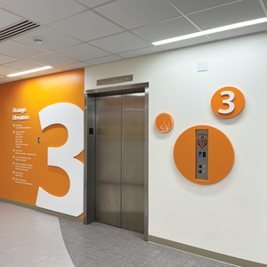
Through thoughtful discussion, we transformed the campus map into a color-coded system. The Bowery Garage became Green Parking, directly connected to the green building (Considine). That building, in turn, linked via a bridge to the front of the main building, which remained yellow to retain familiarity with the existing yellow elevators. The back of the main building was designated orange, aligning with the pre-existing orange elevators.
From there, the main building connected to the Kay Jewelers Pavilion, a space with prominent blue accents. Naturally, it became the blue building, which led to Blue Parking.
Color proved to be a helpful way to guide people intuitively. However, color alone isn’t enough—especially considering that 1 in 12 men and 1 in 200 women experience some form of color blindness. Effective wayfinding must go beyond color to be truly inclusive.
The result was a vibrant and intuitive campus map that guided visitors using both color and clear landmarks. But we knew we needed something more—something Akron Children’s Hospital could truly own.
So we set out to create a graphic system that was engaging, multi-sensory, and memorable—something playful enough to appeal to children, yet refined enough to support a cohesive and professional environment. A system that didn’t just direct people, but made them feel welcome and confident in their journey.
Pick A Strategy: “A Hospital in an Urban Park”
Akron Children’s Hospital is uniquely positioned with a park directly in front of its main building (the Yellow Zone), flanked by what are now designated as the Green and Blue buildings. Inspired by the idea of an urban park, each color-coded zone was reimagined as a distinct natural space:
Yellow became The Playground
Orange became The Forest
Green became The Meadow
Blue became The Pond
Purple, assigned to the Medical Office Building (MOB), became The Urban Garden


This nature-inspired strategy grounded the campus in an imaginative, approachable framework—especially meaningful for a children’s hospital.
Therapy Dogs as Zone Ambassadors
Akron Children’s Hospital is well known for its beloved therapy dogs. Building on that identity, each zone was given its own dog “ambassador,” creating a friendly and familiar face to guide visitors. These ambassadors were paired with themed playgroups—a set of animal characters that lived on each floor—adding another layer of intuitive wayfinding.
Together, the ambassador and their playgroup became playful guides along hallways and at decision points, helping visitors locate departments and portals while creating a child-friendly environment of discovery.
Adding Whimsy and Reinforcement
One extra-special detail: The squirrel. This character is the only animal that appears in every zone. It lives exclusively on Level 3, which is the main level across campus—where the parking garages, bridges, and main lobby all connect.


Spotting the squirrel became a subtle but effective form of spatial reinforcement. If a visitor saw the squirrel, they knew they were on the main level.
Environmental Graphics That Guide and Delight
This strategy enabled the design of vibrant, engaging environmental graphics that guide visitors through each zone while offering moments of positive distraction. Each zone’s graphics are tied together by a continuous line—a whimsical path that morphs into various playful forms: a bouncing ball, a flying frisbee, a bird, a sleeping cat, and back again, leading toward the department entrance where the dog ambassador waits to welcome the child.
The dog ambassador isn’t just decorative—it’s a visual cue that the visitor is headed in the right direction, turning navigation into a gentle, story-led experience.
Balancing Creativity with Budget
To stay within budget, the graphics were tiered in complexity and scale:
Hallways featured “quiet graphics,” where the continuous line subtly transformed into playful objects and characters.
Elevator portals included “light graphics,” with storytelling vignettes that used color and floor numbers to orient visitors.
Surprise graphics were larger and layered, inviting children to search for hidden elements while they waited.
Department desks were filled with solid zone colors, making them easy to spot and reinforcing location within the building.
Branding Woven Into the Experience
The Akron Children’s Hospital brand was thoughtfully integrated into every detail. The circle from the hospital’s logo inspired the design language—appearing in trees, floor markers, accent pieces, and even the exterior signage. The once-square lamp fixtures atop monument signs were updated to circles, reinforcing the brand identity both inside and out.
Looking Ahead
With the rollout of this immersive wayfinding and environmental graphics system, visitors are navigating the Akron Children’s campus with greater ease. Staff members are excited about the transformation, and in areas where the graphics are already installed, children are engaging with the environment in joyful, meaningful ways.
The journey doesn’t end there—our design and digital teams are now collaborating with Akron Children’s to bring these characters and stories to life through an interactive augmented reality experience—blending fun with therapeutic applications for patients and families alike.
–
Are you looking to position your organization for growth in the next decade? Our innovative team of designers and landscape architects specialize in solving problems to elevate your audience’s experience by designing and creating loyal customers that become lifetime ambassadors for your brand.
Whether you are part of a large healthcare system, university campus, or small business we would be honored to bring our creativity and expertise to your organization and the spaces your customers live. To learn more about PLANIT Studios and schedule a free consultation head over to https://www.planit-studios.com/ or call (614) 505-0375.

